Book4Time
Becoming the #1 spa management software in the world is not easy. With so many sharks in the water nipping at your feet, speed and implementation of new features is how you stayed ahead.
Of course, with speed, comes great sacrifice. That sacrifice was an intuitive interface and user experience. New features were built on top of existing features, and without the time to rethink the structure of the page, things became messy over time.
The challenge
Book4Time was in need of a complete overhaul, but with so many Users, and many weeks of training and onboarding per client, the scope of this undertaking had to be minimal. With many businesses relying on this product, in a surprisingly fast-paced environment, disruption had to be minimal.
This meant that we had to break things down into phases. The first phase was to put on a coat of paint and introduce a new UI. Once our customers get used to the new look, we wanted to then start making UX changes to particular user flows to help our customers become more efficient. This two step approach would help us avoid overwhelming our users with both UI and UX changes, which would lead to major disruption and a spike in support tickets.
The fix
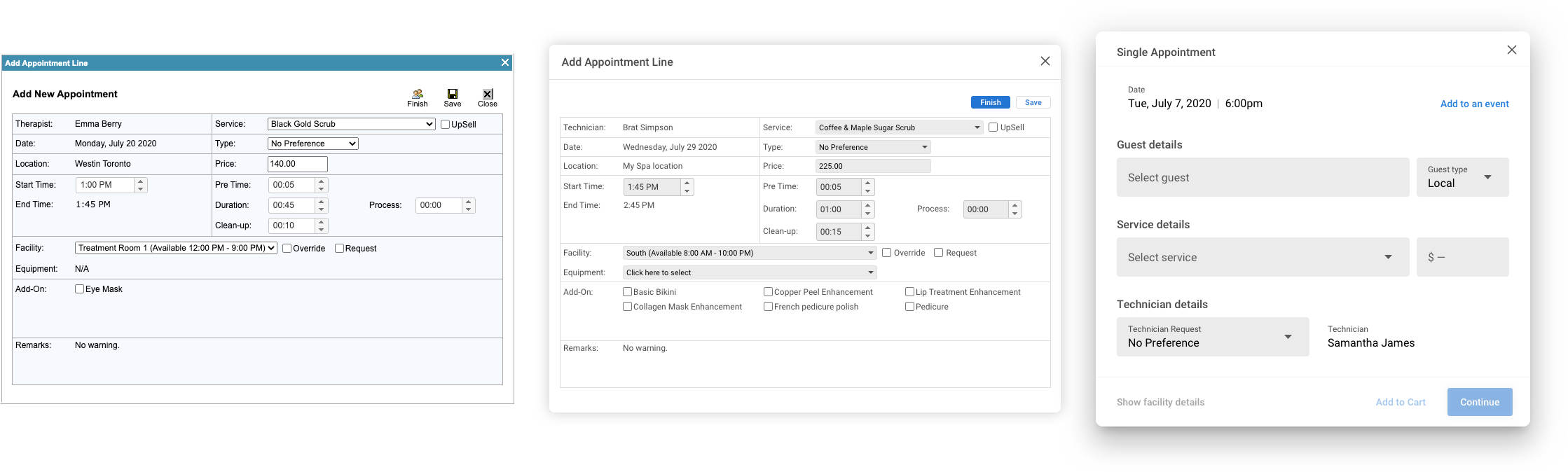
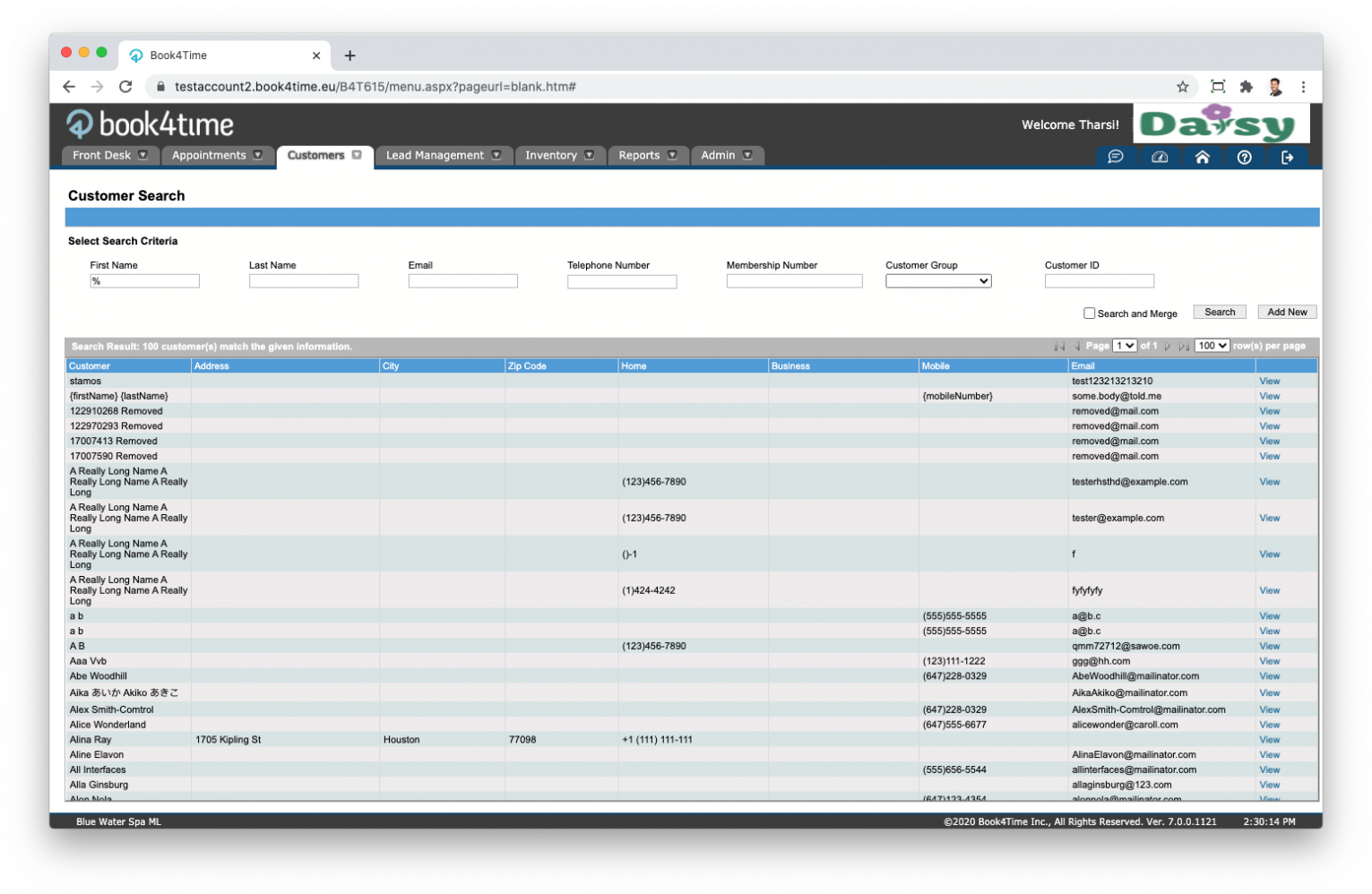
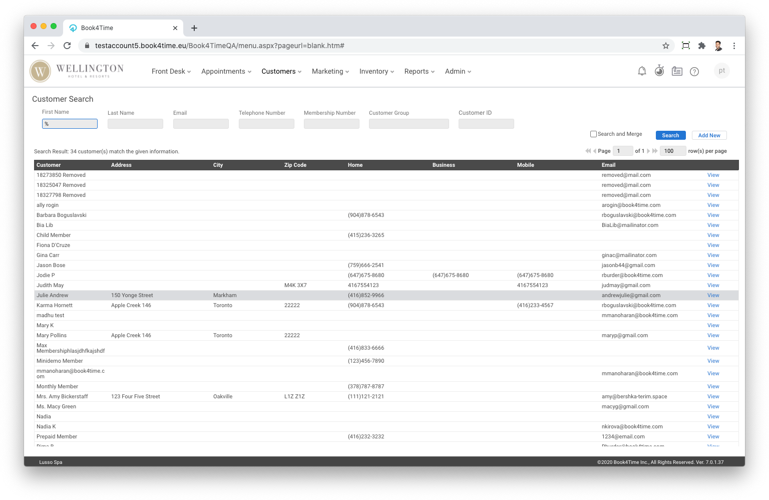
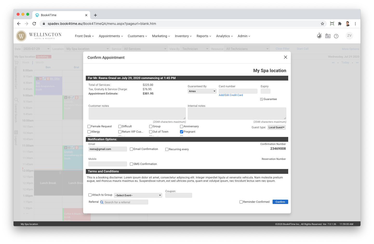
Since UX changes were off limits, we used our UI makeover to solve certain experience issues our users faced. A digital style guide was created for our developers to follow and apply to all pages throughout the application.
The first thing done was to simplify the interface. Unnecessary borders and colours were removed. Necessary icons were updated from blurry gifs to flat vector icons. Fonts were updated from the default Arial to Roboto, to follow the Book4Time branding guidelines.
Colours were later reintroduced in a more meaningful way that helped guide users through the application. With a blank canvas, input fields and drop-downs were styled with a grey background so that they would stand out on the screen as interactive elements. The introduction of primary, secondary and tertiary buttons (with both positive and negative actions) helped guide the users on the page.
Modals previously had multiple borders to separate it from the content underneath. The new style removed the borders, and added a soft shadow to help it rise above the content below.

The next step
With the way the platform was built, every element had a fix position and fixed height. This hindered our ability to increase font, button, and input sizes to today’s standard sizes. As part of phase 2 with the UX changes, will be new components (based off of material design) that will come with its own influx of functionality that will better the experience for our Users. Features such as sortable tables and auto-filtering dropdowns will make it easier to find the information that they’re looking for. Material’s filled in inputs with floating labels will help group relevant information together, like labels and inputs, to reduce the cognitive load on our Users. An increase in font sizes will lead to better readability, increased button sizes will lead to quicker clicks, and a responsive layout to maximize the screen real estate.